Top 4 Contemporary Japanese Illustrators
The Most Popular Japanese Clean Line Style Illustrators
Firstly, it’s near impossible to choose a favourite so I will list 4 Japanese Illustrators who are doing amazing work right now! Their simple, bold and playful illustrations are seen everywhere from advertisements for large corporations to boutique donut shops. Their drawings can be found here in Australia too, and I’m so excited that the classic, clean line Japanese style of design is really taking off in Western countries.
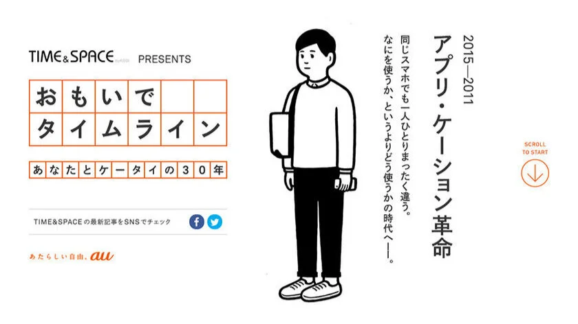
Noritake.org
Noritake’s visual work can be found on many advertisements in Japan. The above is for one of the main telecommunications companies, Au. The simplicity of his style means he exists in the awesome cross section between illustration and graphic design. He’s created many logos and icons as well as exhibiting as a respected artist.
He has created covers for Japanese fashion magazine Brutus, and English magazine, Forecast (of the Monocle family). See more of his work here.
2. Yu Nagaba
Another awesome Japanese Illustrator you may be familiar with is Nagaba Yu, also known as Kaerusensei (which means frog teacher, I’m not sure why this is his nickname!).
Yu Nagaba is in high demand, both in Japan and overseas. You may have seen his very simple and stylish designs on Uniqlo, Asics and Graniph t-shirts, and multiple advertisements. Here in Melbourne, I was stoked to see his work at a local cafe called Parco.
His drawings, or more broadly, the Japanese clean line monochrome style is synonymous with an understated cool and high quality. It makes total sense for companies to incorporate this high end street aesthetic into their branding. See more of his work here.
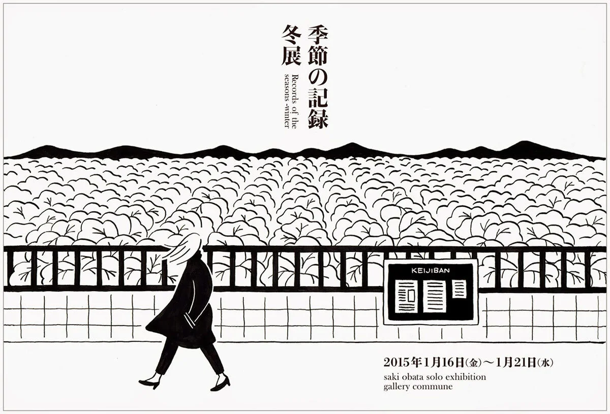
3. Saki Obata
Slightly less known but just as amazing as Yu Nagaba and Noritake Org is Saki Obata. Obata Saki is a graphic designer and illustrator who’s gorgeous work can be found on everything from book covers to street signs. She also exhibits as an artist. View more of her work here.
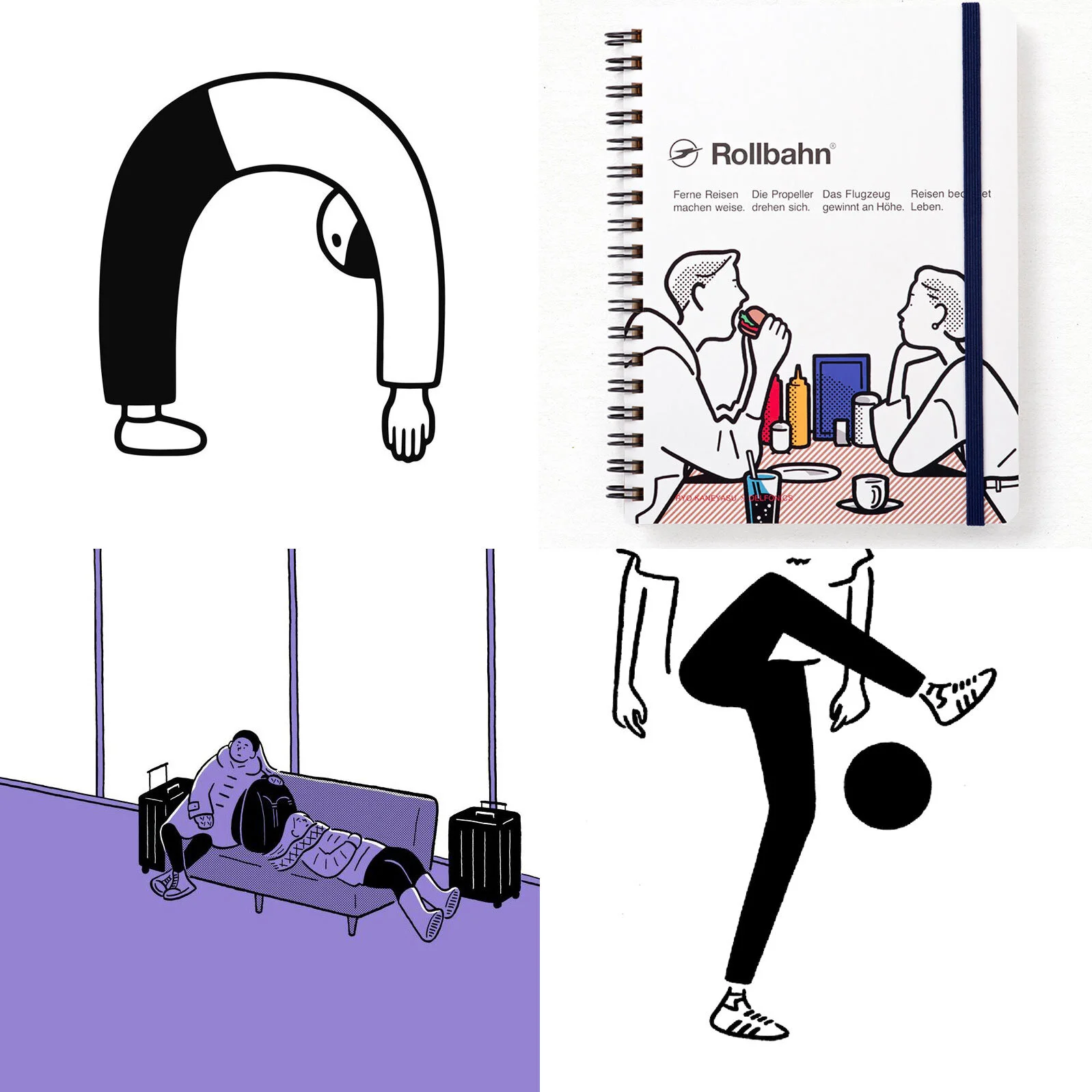
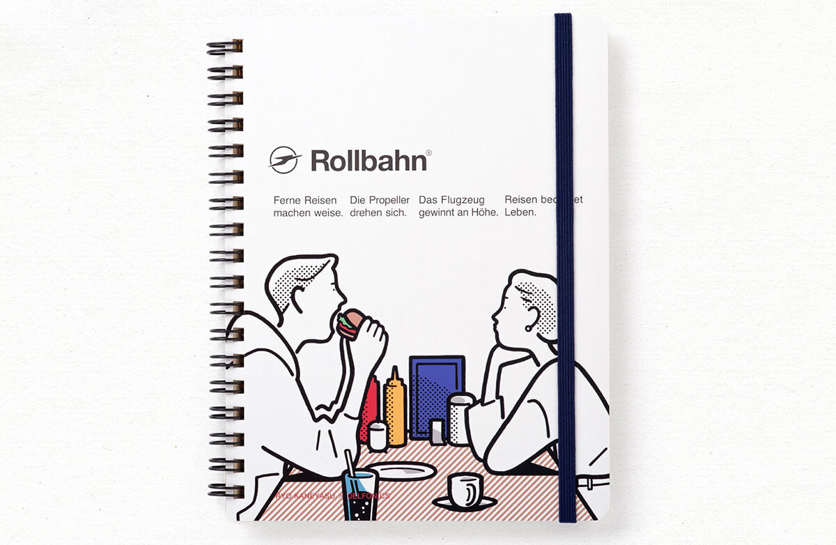
4. Ryo Kaneyasu
Last but not least, a personal favourite, Ryo Kaneyasu. Kaneyasu Ryo has a playful minimal illustration style that is highly adaptable. His work features in magazine infographics, apparel for stylish brands like Beams, album covers and web banners.
He often works in black and white but his coloured work (often with spot colour elements) has a nostalgic palette which I love. You can see more of his work here.
I believe the above illustrators are around my age. Many of us grew up with the simplicity of 80s and 90s Japanese manga (which is a lot different to current day manga, you can read more about that here). We also grew up with the amazing work of artists like Osamu Harada so for myself at least, that really influenced my drawing style.
The popularity of this style over recent years makes total sense, as it conveys messages in a clear and fun way both digitally and in print. The Japanese clean line illustration style has become synonymous with creativity, style, quality and a grown up playfulness, an aesthetic any brand which aims to be adored should look to incorporate :)
About Natalie Ex Design Studio
Hello, my name is Nat. I’m a qualified and experienced Illustrator and Graphic Designer in Melbourne. I have a Bachelor of Visual Communication Design and over 18 years of industry experience in illustration, graphic design and digital marketing.
The trademark Natalie Ex aesthetic is a playful and polished clean line style, inspired by my half Japanese upbringing.


